Put to Call ratio chart compared to the Dow
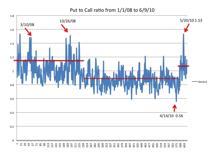

I thought today I would post a chart of the Put to Call ratio from January 1st, 2008 to the close of yesterday's trading. On this chart I have drawn 3 red lines to show the shifts this ratio has made. The recent shift occurred similarly back in March and October of 2008, when the market signaled it would reverse the trend and go down sharply. I am of the opinion that this 3rd shift up in the Put to Call ratio is the canary in the coal mine that portends of the market drop similar to 2008.
I have also posted the Dow for the same time period with arrows on key dates for comparison. The pause in the current market decline is temporary and while it is tempting to me to buy some Call options on some stocks, it is a foolish thought, as the overall trend in the market is negative.

As you can see from this 2010 Put to Call ratio chart above that we are defintely in a higher period as more and more people are not believing all the hype that things are getting better and the recovery is stable right now. This would indicate to me that people don't believe it as they are buying more Puts to protect themselves. It's the mood of people stupid! It is negative!
It would be a better use of my time to Buy some various Put Options on stocks or Indexes, or buying Calls on TZA. Remember, TZA is already a an Ultra Short ETF which goes triple the daily move of the Russell 2000. Good luck out there today. The Futures point up after a benign Jobs report this morning. I may post additionally today Intraday charts and analysis. So check back.
Labels: Call Options, Dow, Dow chart, Put To Call ratio, TZA
posted by Charles Amico at 5:41 AM
![]()
![]()
0 Comments:
Post a Comment
<< Home